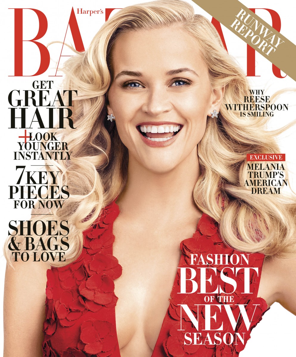
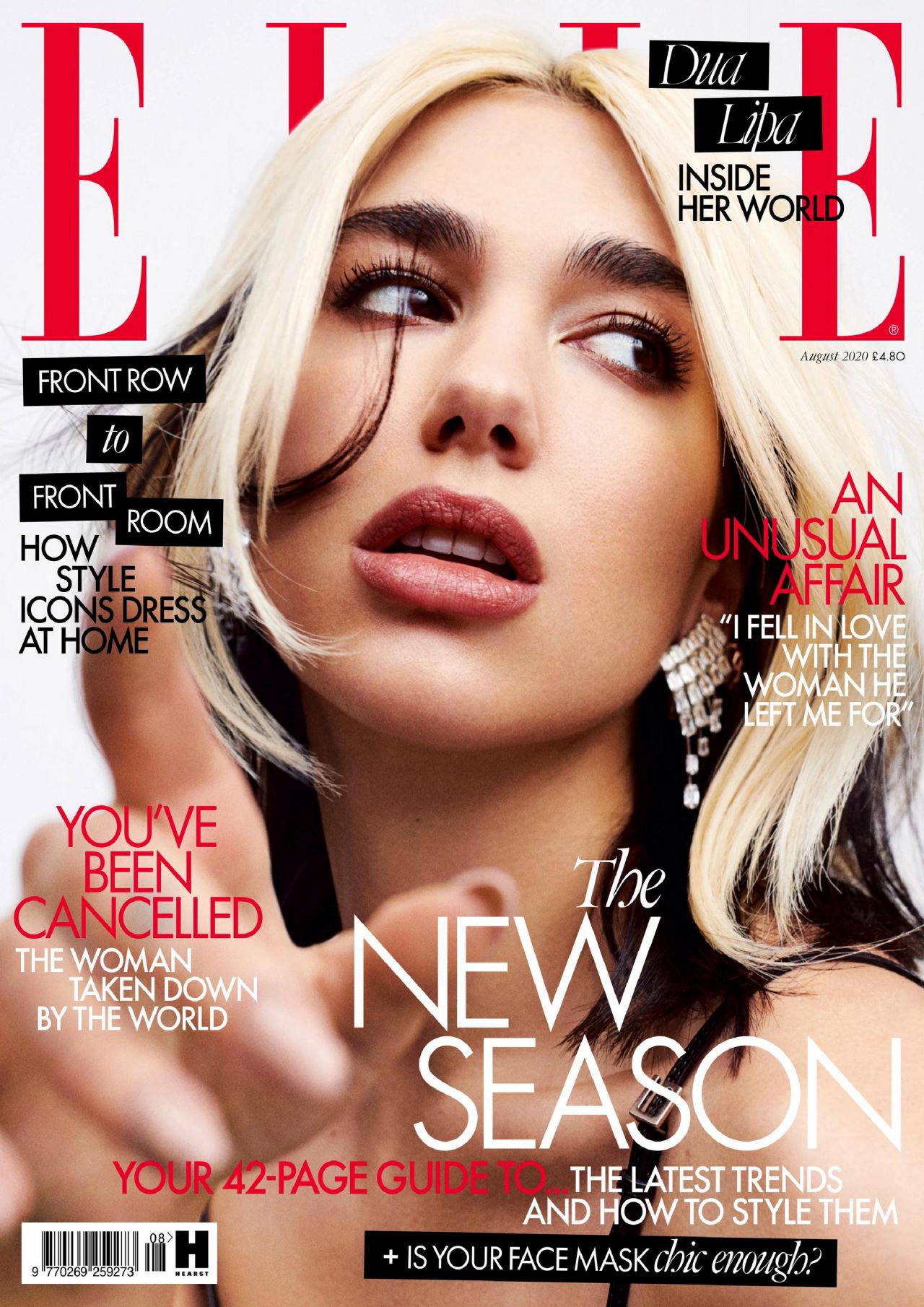
Examples of Hearst magazine covers
Common conventions:
- Bold Masthead at the top of the cover
- Use of Sans serif fonts for cover lines and mastheads#
- Masthead behind the cover star's head, that's how big these brands are that their noticeable enough to slightly cover
- Cover lines with celebrity drama/confessions
- Theme of consumerism, cover lines trying to sell a product - "shoes and bags you'll love" "is your face mask chic enough?"
- Cover lines positioned around towards the edges of the cover star
- Content focus on fashion, beauty and health/fitness


No comments:
Post a Comment