Front page mockup:
I added my coverlines from my first mockup and just changed the image
I've started the first draft of my Contents page. I've tried out different fonts with the same text. My favourite fonts are Contents Page and Abena. I think Abena is more suitable because it matches my Masthead's font so this creates a sense of brand identity and establishes a consistent house style.
I added an image on half my contents page on a few layers to be able to see different versions of my conentapage by playing with the visibility of the layers
I made 3 squares which will act as a guide while a write text in 3 column each A4 side, then I added images including oe of the cover star's new brand deal.
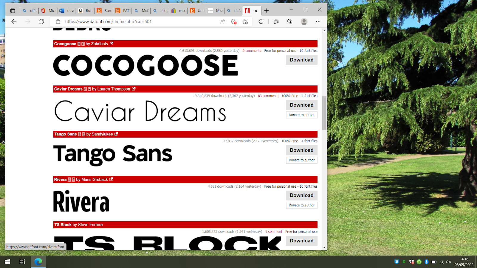
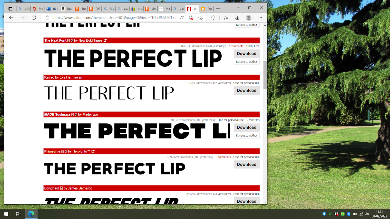
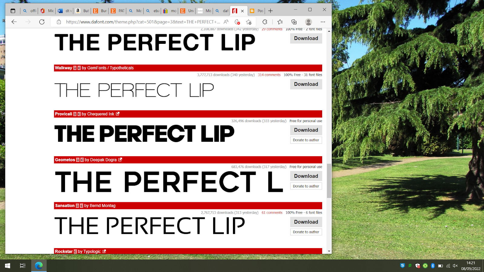
I then looked for fonts to use for my copy and the numbers I'll use to number the articles and reference pages
Hiro Misake
Badly Stamped
Type Keys
My favourites are Hero Mistake and Badly stamped and Ill try them out on photoshop to see what they're like
I Think this font isn't suitable or sophisticated enough for my brand. I like the look of the 4 of my front
cover so I will try out the numbers in Abenda
I printed my page out in A3 and found the text to be too big. So I sized down to 9pt from 11pt for my copy and the article titles to 12 pt and the numbers to 36 pt
I decided to add an image of food as this is a lifestyle magazine and I have to cover a range of themes and genres. I have removed the picture of the model with pride makeup and have decided to write in my contents page a call for action directing the audience to send in their pride looks so they can feature on the website then I will add the picture onto the website as if a reader made it onto the website.
I've decided to add a cover letter to set the tone of the magazines first edition and to establish some brand identity
My first draft of my cover letter is here and as you can tell its too long so I will refine it into a more precise version
Articles:
The articles range from Beauty: Perfect Lip to Fashion: Beachside drip to Entertainment: with the GOT articles and Marvel, Food: Sushi Mania, Environment: Greenest Jeans Politics: Ukraine and US abortion laws
Reflects the zeitgeist: Social media and the theme of viral content in: The perfect lip.
Intertextual references the target audience's cultural competence would allow them to decode: Rags to riches, Dracarys
Representing different social groups: Black female model on contents page
Fulfills the brief "The feature article or extract should expand upon one of the cover lines on the front cover" - Tape ins on the cover and fake it til you tape it - War, Devastation cover line, article on contents page on Ukrainian civilians
Brief: "It is important that learners research double page spreads and are aware of how they use elements of media language and construct representations." - I have my title of the page at the top left and 3 columns on each A4 page
This is my contents page without the boxes and I think the margins look good
I plan to add an e-signature at the bottom of my Editor's letter and a picture above so this coming week I need to work on shortening my editors letter and figuring out how to get an e signature onto my PC
I also need to add a streamline barcode edition date etc to my front cover. I need to reshoot more footage this week for my first front cover
I added a picture of my Editor and shortened my editors letter and drew a few signatures. I magic rubbed the background and stretched it out and added it under the editor's letter
I've started on my website and have used a six template
I decided to change the font of the masthead to match my magazine covers' font to "establish the sub-genre and house style of the magazine." as instructed by the brief. I may change the articles picture depending on if I keep it on the contents page or not.
I added icons which act as links of social media platforms at the bottom of the homepage and menu page to demonstrate cross-media convergence
I'm making a styling video for my 30 second audio visual. And this is an outfit plan that matches the outfit from the will
My clip has intertextual reference to clueless' outfit generator. I will either edit a picture with the outfit maker on the thumbnail or incorporate it into the actual video depending on my editing capabilities. My brand will have a partnership with Pretty Little Thing so I've added "Sponsored By" in the corner and Pretty little thing in the coolvetica font to resemble the logo, which is recognisable and popular amongst my target audience, and I've also added clothing items labelled as PLT clothing and referenced their names to promote the brand.
I have added Poise X StyledbySharae to the top of the page to display the magazines partnership with the fictional stylist Sharae mentioned in my contents page.
For the hair section in the top corner I will add a picture of a black model to fulfil representation of different social groups.