The name of my magazine is Poise as the name would attract this audience as it connotes confidence, grace and style which the aspirational audience would be drawn to as they seek status. I want my masthead to connote this grace and style. These are a few magazines that I aim to mirror the way fonts connote grace and style:
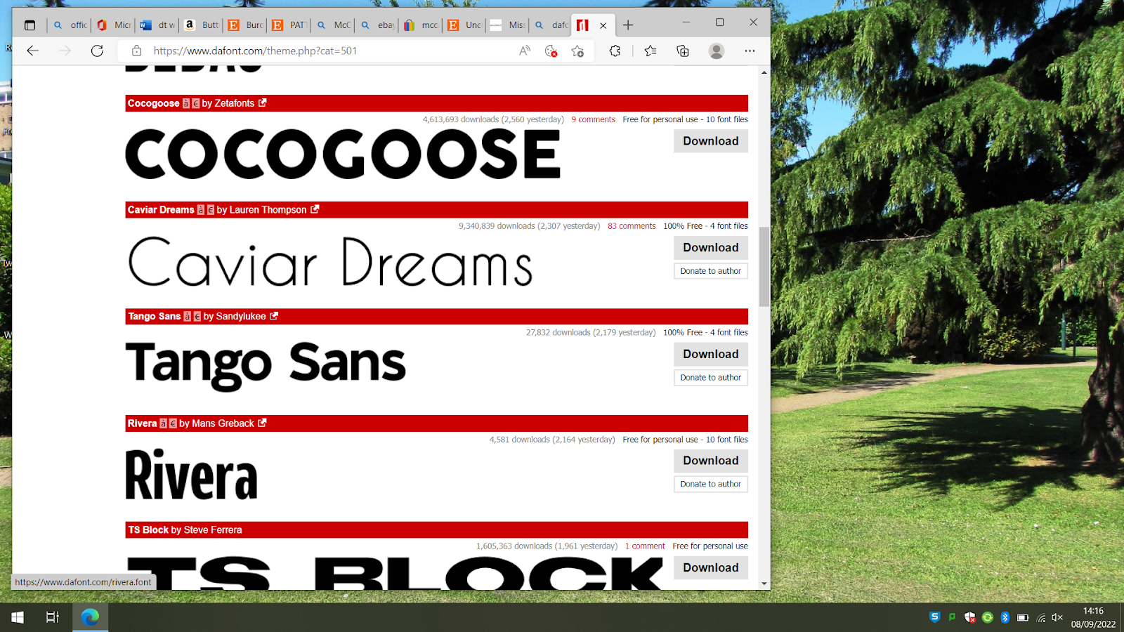
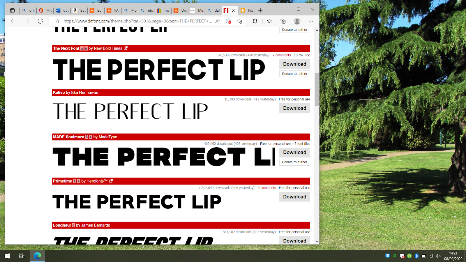
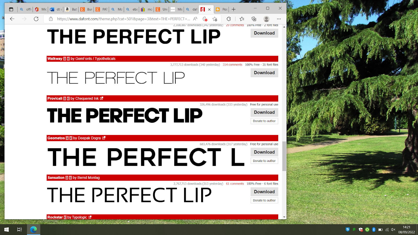
So I started looking on dafont.com for fonts like this and screens hotted the ones I like to start narrowing it down
My top 6 fonts are:
Quaker, Artisan Deco, Abenda, Athena, Official and South Amsterdam
I like Quaker because the O has a unique look however I think this might be too thick and bulky. I also like the look of South Amsterdam, how simple and chic it is however I think it might be too thin and will look overwhelmed or washed out after being stretched out on a cover.
My top 3 fonts are:
Artisan Deco, Abenda, Official and Athena
I'm going to make mock ups of magazine covers to visualise which font best suits my brand. Here I've used a picture from one of my photoshoots for my mock up, I am yet to decide which one will be my cover picture
Athena:
I really like the sleek look of Athena and how well it complements the cover. I like the style of the O and how the letters go slim at certain points, I think it connotes elegance.
Official:
I like the simplicity of this font however I think its too plain so will not be using it.
Artisan Deco:
I like the look of this font however I think its too thick when stretched across the length of the cover's top section and doesn't suit my brand, so I will not be using it
Agenda:
I really like the sleek look of Abenda and how well it complements the cover. I think it's quite similar to Athena how the letters go slim at certain points, I think it connotes elegance.
My top choices are Athena and Abenda. Because they're s similar I think I'll make the definite decision on my cover with the chosen picture so I can fairly judge if it suits the cover and style.
fonts for cover letter
Charlotte : retro signature, brittany signature, Maytra
coverlines:
caviar dreams
CORMFORTAA
KALIVO
walkway
vogue:
Brittany Signature for the cover star's name
Vogue for the red lines
Kalivo for the black text apart from capitalised text in Vogue
This is my first cover mock-up but I've decided to se a different picture because it may seem too similar to another students' cover image


No comments:
Post a Comment