Wednesday, 29 June 2022
Tuesday, 28 June 2022
Tuesday, 14 June 2022
Friday, 10 June 2022
Online Textual Analysis 2 : Paper Magazine
Online Textual Analysis 2 : Paper Magazine
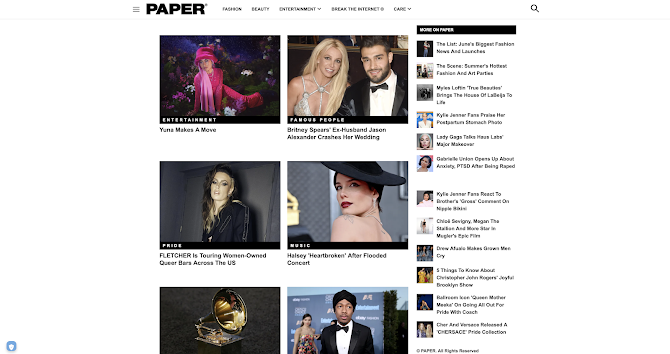
- Home page scrolls down leading stories from different sections of the newspaper
- Masthead at the top of the page to create a sense of brand identity
- Search icon that leads to a search bar for audience to search up articles
- navigation bar at the top of page that has links to the main sections of the magazine which leads to relevant articles
- Home page with a main image taking up most if the page
- Masthead at the top of the page even hewn you scroll down to create a constant sense of brand identity and maintain house style
- Three horizontal lines act as a menu which people click on to see the magazines sections of content, how to contact, Terms, Privacy policy
- Shop section on menu adheres to consumerist nature of magazines
- After clicking on a section the page is filled with articles filtered to fit the theme of the section
- Stories subhead by categories they fall under e.g in entertainment section Pride, Sports, Famous people
- On the left is a mixture of the latest articles from PAPER regardless of what section is clicked to intrigue audience to look into different types of articles
Thursday, 9 June 2022
Online Textual Analysis 1 : Dazed Magazine
DAZED Magazine
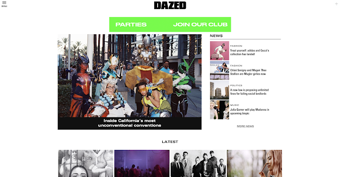
- Brand identity reinforced
- House style established with consistent use of the same font
- Menu link on the top left instead of a navigation bar at the top
- Masthead at the top of every page reinforcing brand identity
- Colour palette creates a house style, same grip from the pop up
- Subscription service - listing benefits reflects consumerist nature of magazines
- Subscription refers to print copies, open calls, newsletters - example of cross technological convergence
- Navigation column lists the different sections and perspectives of info DAZED offers to attract the customers interested in certain things.
- Icons of social media platforms with links to the social media - example of cross media convergence
- Section labelled "contact" allows the audience to give feedback to DAZED - keeps audience active through
- Heading "Latest" connotes fresh news keeping the audience updating fulfilling need to be current
- Sections of interest indicated underneath pictures of articles to inform audience what genre it falls under e.g Fashion, Politics, Music, Film & TV
- Pop up to subscribe to the mailing list - cross media convergence
Wednesday, 8 June 2022
Textual Analysis: Glamour - Selfcare
Typography: -Sans serif Masthead, typical of mainstream magazines, adheres to the brand identity of Glamour and its house style -Bold 'digital UK issue' to easily stand out as a form of brand identity -Cursive typography to depict "Jesy" to provide a sense of authenticity as it resembles a signiture. -Serif font for " Layout: -Celebrity in the centre of the page with cover lines surrounding them about articles inside -less cover lines about other featuring articles to highlight the focus on cover star's story, reflects how mental health is often overlooked by other factors in life -Typical feature of masthead and date at the top of the page Language and images: -high key lighting- typical of the conglomerate of Glamour, professionalism -Cover star wearing makeup, typical convention reflecting the brand and meaning of the word Glamour -open body language reflects how open cover star is about her story -direct mode of address creates sense of intimacy and vulnerability - "self care" in white has a softer tone against black "the" and "issue" reflecting the nature of delicay with self care.
Tuesday, 7 June 2022
Subscribe to:
Comments (Atom)


